Saturday, September 22, 2012

Digital Painting of a Tree Frog

.
Ok, so I swore I would never create, much less appreciate a digital drawing. I've come to have a new found respect for them however after finding a huge lack of time and creativity. This was created quite quickly with an awesome program called Paper by 53. 

Using my iPad and a stylus and then just good old fashion drawing methods, I am able to squeeze in a little drawing time when I normally wouldn't care to lug out the art supplies...especially in front of the 2 year old! 

Did you see how long it has been since my last creation? Exactly!

Sunday, May 27, 2012

A little change - Watercolor Daisy and Ladybug

Watercolor on Canson 9x12
Just a quick update with a watercolor piece. I realized if I am going to ever attempt plein air painting, I need to get back into my watercolors.

As much as I have fallen in love with the soft glow of pastels, I am not prepared to create a travel box of them and the watercolors come in such a portable, ready to go set! I need to watch some other plein-air soft pastelists and maybe I can put together a small box. I do so need to learn about the greens!

Saturday, May 26, 2012

Working again on being more painterly, Continued!

Being more painterly, a lot harder than it looks! 

As you may have already read,  I struggle with creating art that I actually love. I am a left-brained artist; that is, I paint what I see. But I admire those works with those strokes that are soft-edged, flowing, have movement in them and evoke that emotional appeal. 

I have continued to try to work out of my comfort zone and found a reference photo at Wet Canvas that was part of a soft pastel workshop last month. 

This tricycle made me feel young again, and love the timely feel of it. My son also has a very similar red, Radio Flyer tricycle so it reminded me of him. 

I started with the contrast underpainting again, a style I have grabbed hold of fully, and attempted to only "suggest" the lines of the tricycle, the trees, to soften the focus in the background and basically take these last few months of learning this medium and practice all those techniques in one painting! I find the vignette style edging actually draws you in to a "memory" or dreamlike moment, so I kept it. 

I would love to hear your comments, especially those of you who have seen my detailed works. Is it an improvement or does it need something else? 

Thursday, April 26, 2012

Monochromatic Sailboat Painting: Creating Contrast With One Color


Sometimes I use internet art-based forums to find challenges that motivate me to try something new. This month's challenge on "Paint My Photo" is to interpret a photo posted by another member with a monochromatic painting. It's a really great site where people freely post their original photography and basically let you create whatever it motivates you to create! Some of the stuff people are willing to share is simply stunning, such as the original to this piece here.

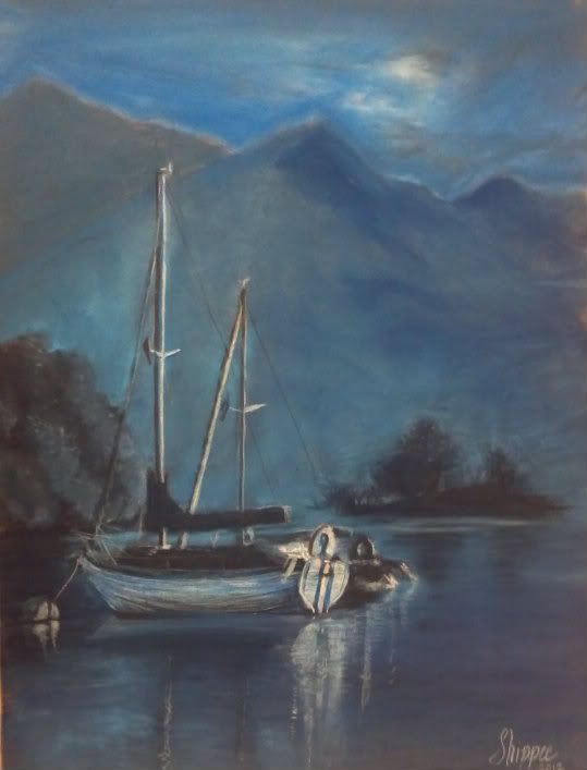
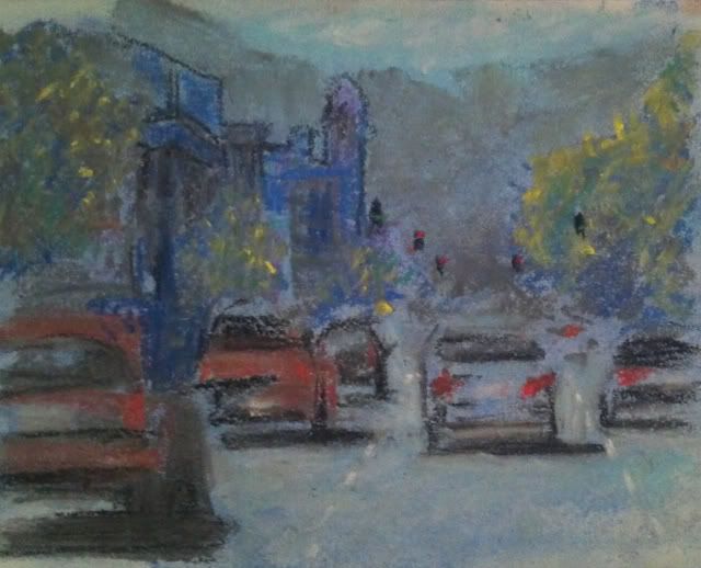
9"x12" Soft Pastel on Pastelmat
"Evening Tranquility"
I found the beautiful photo of a boat moored on a still lake on the site and it has such a terrific mood to it. I had originally planned on painting it with the colors intact, but this challenge seemed to fit well with the general tone of the original leaning towards a blue tint.

The only concern I have is that the cream cast that the paper is creating. I had actually tinted the paper, that is, take one mid-tone blue and swathed it on the entire thing, lightly filling the tooth of the paper so this exact thing wouldn't happen. Perhaps I should have scrubbed it and done another layer. It's very interesting to note that even though I only used 4 shades of blue.. a very dark navy, a normal navy, a midtone blue and a fair sky blue, thanks to the paper and the photograph, it has some interesting grays, creams, and even some violet there in the right corner; I see it!

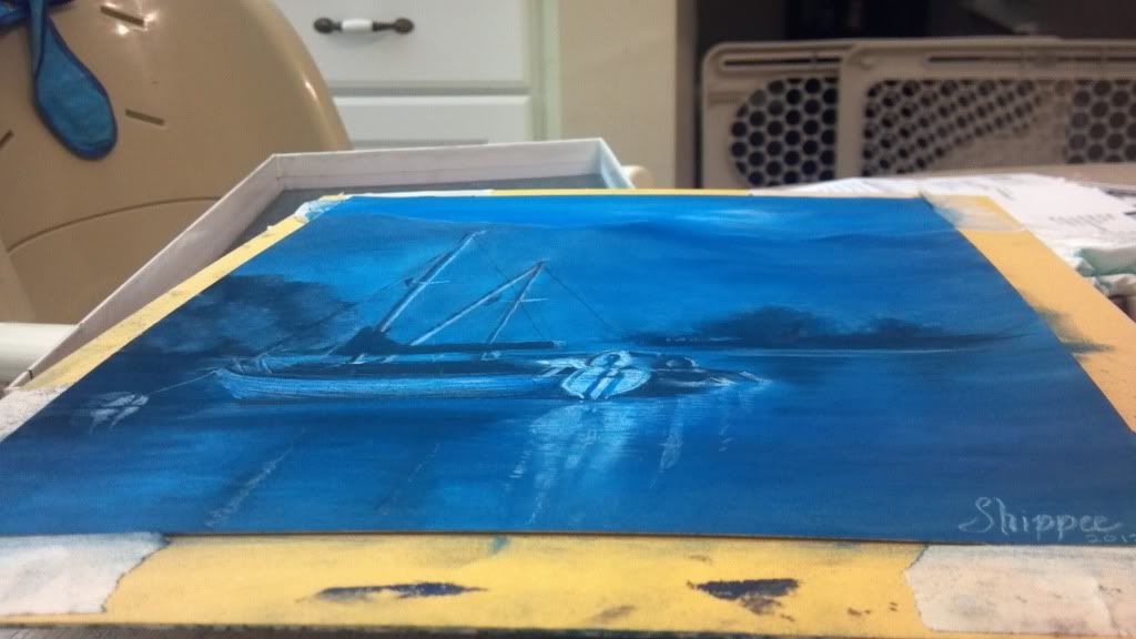
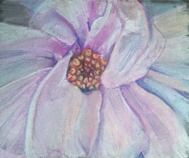
A little more true to life. 
As I walk away and contemplate it, I like it more and more. But in real life, the cream and violet isn't a true attribute of the painting, as you can see here with this photo of it at an angle, the paper peeking through isn't as vivid in real life.  So what do you think? A happy accident, maybe? I'd love to hear your comments. Maybe next time I skip the underpainting and let the cream do its thing?

Thursday, April 12, 2012

Koi Fish: Trying To Be "Painterly"


Can one learn to be more "painterly"?

I am working on being more "painterly" that is, to work a little less detail into a painting and make it more interesting with less deliberate strokes. I find it a struggle as a left-brained artist; I tend towards painting what I see, in the color I think I see. I have been continuing to use the contrasting colors to start my paintings (see earlier blog post about using the opposite color to start a painting) and have been trying to be less deliberate about my paint strokes. 
So can this be learned?? I am hoping so. I admire those works that have distinct moods thanks to the bleed of color here, the daub of color that didn't occur in real life there. 
Some things I have tried in the Koi Fish painting: 
Stop pouring over the details. Those hairs/scales/patterns only need to be suggested, not every one needs to be filled in.
Dot in a color that isn't really there. Drawing a white cat? Put some sky blue and pink through the fur. It really won't look unnatural, just more like art and less like a copy. It really is hard to place bits of color that aren't really there, but I am learning that it really does help to make it overall more interesting. 
It's not always a mistake. It's a drawing, so even if it isn't really happening in the photo, you get to choose what feels good, not what is necessarily "right". 
These are just some ideas that I've picked up by really digging into those pieces that draw me in through more than just the scenery. 
Do you have any ideas that can make a realistic type painter more "painterly"? I'd love to hear from you! 
9"x12" Koi Fish "Surfacing"
Soft Pastel on Colourfix

Sunday, March 11, 2012

Color contrast study - Fox in Pastel

Fox 4"x5"
Mungyo pastel on Strathmore Pastel Paper

I had a fun time playing with color. I was trying to block in the blue but it kind of took over the darker part of the fox. Just having fun. I may tweak this a little, but for now it was just some practice with my new pastels.

Sunday, February 26, 2012

One Magnolia - Georgia O'Keefe Style


One Magnolia
6"x7" Soft Pastel on Mi-Tientes


I made this to contribute to a challenge to try to paint up close and frame-filling in the style of Georgia O'Keefe. I had never painted a magnolia before and this is only my 3rd attempt at soft pastels. I must admit I am liking them and feel I may need to upgrade. I have "Hobby Lobby" variety at this time which is at best a student grade. With pastel sticks starting around 2.00 or so...it may just be a while.
I didn't have any sort of light palette. I had fuschia, turquoise, and a creamy orange that I used to lay in the values. I then took about 1/4 of my white stick to try to make the colors I was missing. Maybe I'll buy some singular sticks in a white palette to start my collection, as you should really never use true white in your artwork if you can avoid it. 
Check out the progression... I hope you enjoy it!
I

Thursday, February 23, 2012

Working Loose - A new thing for me - Street Scene

I was challenged this week by a blog that encouraged you to "Simplify"... that is, don't sweat the small stuff! As someone who thrives on details, I found that I needed to take that step. I worked quick and small, knowing that if I went bigger, it would give me room to put more details; If I kept at it, I would somehow find a way to finagle lots of details in where I thought they should be!

City Scene One
Soft Pastel on Strathmore sketch; 5"x 8"
Working in a fairly new medium to me (the tabby in profile drawing below is my absolute first soft pastel piece ever; this is my second) I decided to let the implied colors thrive. It was fun. I am only somewhat satisfied as I cannot feel it as complete, as simplified as it is from the original. I must learn restraint! I do enjoy the learning experience that comes from this. I will work more on being "loose" and a bit more abstract. 

As always, I would love your critiques and comments. This is new composition and a new medium. Heck, I've never even done a landscape before, much less a busy street scene! Be kind. 

Sunday, February 19, 2012

Siamese Cat on Newspaper - Black and White Pastel / Charcoal

Step 1. Charcoal Block In of Siamese Cat on Newspaper


Step 2. Lay in mid tones and grays in Siamese and newspaper
Working on a new project. I want to try out the pastels some more. Still not sure how I'm going to work this one out. 
Step 3. Start to lift some color out of paper with eraser and
detail the newspaper


The subject is a Siamese Cat, with vividly lit eyes doing what cat's do... crawling into the middle of the newspaper and getting comfortable. I got the idea to start this piece after I put a piece of paper I was measuring for my next piece on the ground (my first mistake), and my cat decided to walk right into the middle, essentially destroying it for professional work (wrinkles and crinkles). 


This is not my cat but the situation reminded me of a photo circa 1947 that I had in one of my cat books. I had been wanting to endeavor it but I am not the most patient what with all the newspaper print. It *will* be interesting, especially since it is French! Work in progress. Will continue to keep updated as I progress.

I toyed with the idea of coloring in the cat. Seal Point Siamese Cats have such beautiful cream coats and creamy brown "points" or darkenings. I started with the blue eyes as my first bit of color, and, well, I kind of stopped there.

A pop of color. Cat eyes are so fun. Starting to detail
the paper and Siamese cat


What do you think? 

Saturday, February 18, 2012

Color Theory - A Study in Contrast Block-in - Soft Pastel


Lately I have been devouring information like an art student about things I had really  taken for granted when I was attending art class. In the last week I have learned about color - theories and ways to improve my craft. 


The coolest thing I learned recently and never knew was that if you "block-in" a piece, that is, take the dark areas and the light areas and create color maps or blocks of color, and instead use a color opposite on the color wheel (For this orange cat, I used a blue block in... light blue for the brighter parts and turquoise-type blue for the darker brown areas; for the green background, I started with lavender for the bright areas and fuschia for the darker greens). 


The reasoning behind this is that any color next to its contrast color will "vibrate" or pop. Using contrast palettes to start with creates a certain richness that come from the blending of these colors. When the contrast color pops through, there is more depth and complexity overall. 


As an artist who is used to creating by drawing exactly what I see, it would have been normal habit for me to block in the cat in creams and oranges, and lay in the browns before coming over top with the details. The final piece may be more bright and sunshiny, but for today's attempt, I was going for a bit more depth and tone. 

This is the result of this study, and I am very happy with the outcome. The blue that pops through the cat's fur definitely makes the piece more interesting. I never would think, hmm.. lowlights in blue, but it definitely works. The soft pastels are very "loose" (not a lot of detail, or tightness) and since I do not have pastel pencils, (which help with the refined strokes, since they are able to be sharpened like a pencil) some things are lacking in detail, such as the eyes and nose. 

I would love your feedback and encourage you to try a small picture with this style and see if you enjoy the outcome. 
5" x 6" on Strathmore white paper 
tinted first with blue and gray


Saturday, February 11, 2012

Reflections


I started working on the concept of a reflection of this Westie but am struggling with the lack of "physics"in this piece. What I mean, is....you would think, even though this is a highly polished floor he is sitting on (and I am referencing from a photo) that there would be a darkening of the floor and dog, but in actuality it is quite bright and even brighter in some spots rather than darker, even though the floor is of a terra-cotta coloring. 

I think the sun is emblazoning it to make it brighter, rather than making the subject diminutive. I may have to crop out about half of the reflection to not make it such a focal point, though I am enjoying the attempt at creating it. Others have told me I should take out the reflection or darken it...but the photograph tells me otherwise. Should I go with artistic license or take a chance at actual recreation? (my strong point... I don't consider myself a creative artist as much as a good reference artist). I'd love your feedback. I may change the crop and concept. We will see! Thanks for viewing.