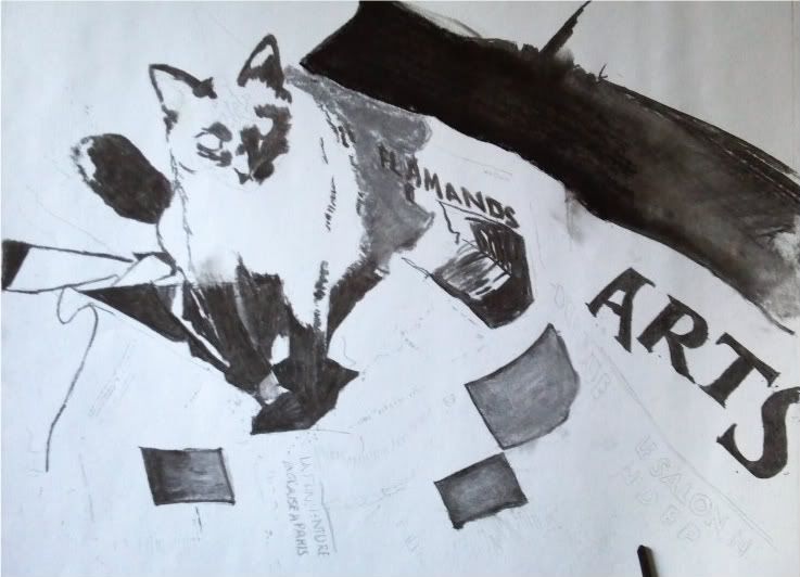
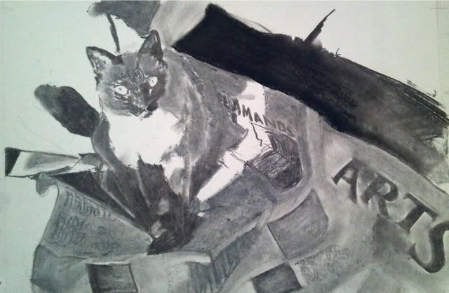
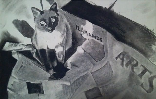
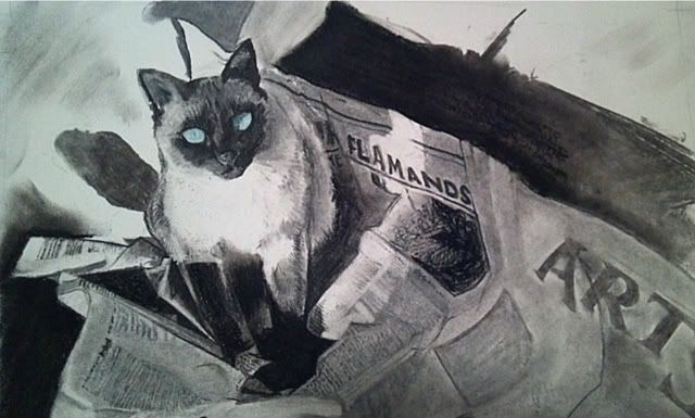
Lately I have been devouring information like an art student about things I had really taken for granted when I was attending art class. In the last week I have learned about color - theories and ways to improve my craft.
 The coolest thing I learned recently and never knew was that if you "block-in" a piece, that is, take the dark areas and the light areas and create color maps or blocks of color, and instead use a color opposite on the color wheel (For this orange cat, I used a blue block in... light blue for the brighter parts and turquoise-type blue for the darker brown areas; for the green background, I started with lavender for the bright areas and fuschia for the darker greens).
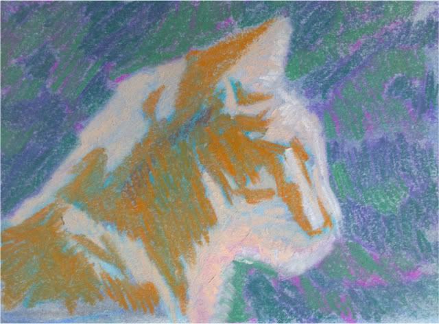
The reasoning behind this is that any color next to its contrast color will "vibrate" or pop. Using contrast palettes to start with creates a certain richness that come from the blending of these colors. When the contrast color pops through, there is more depth and complexity overall.
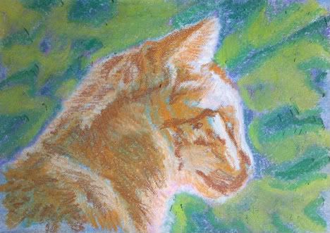
As an artist who is used to creating by drawing exactly what I see, it would have been normal habit for me to block in the cat in creams and oranges, and lay in the browns before coming over top with the details. The final piece may be more bright and sunshiny, but for today's attempt, I was going for a bit more depth and tone.
This is the result of this study, and I am very happy with the outcome. The blue that pops through the cat's fur definitely makes the piece more interesting. I never would think, hmm.. lowlights in blue, but it definitely works. The soft pastels are very "loose" (not a lot of detail, or tightness) and since I do not have pastel pencils, (which help with the refined strokes, since they are able to be sharpened like a pencil) some things are lacking in detail, such as the eyes and nose.
I would love your feedback and encourage you to try a small picture with this style and see if you enjoy the outcome.
5" x 6" on Strathmore white paper
tinted first with blue and gray

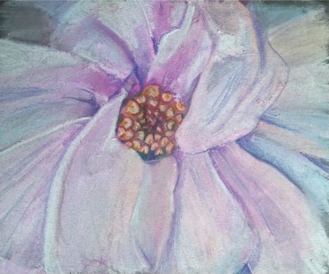
 I made this to contribute to a challenge to try to paint up close and frame-filling in the style of Georgia O'Keefe. I had never painted a magnolia before and this is only my 3rd attempt at soft pastels. I must admit I am liking them and feel I may need to upgrade. I have "Hobby Lobby" variety at this time which is at best a student grade. With pastel sticks starting around 2.00 or so...it may just be a while.
 I didn't have any sort of light palette. I had fuschia, turquoise, and a creamy orange that I used to lay in the values. I then took about 1/4 of my white stick to try to make the colors I was missing. Maybe I'll buy some singular sticks in a white palette to start my collection, as you should really never use true white in your artwork if you can avoid it.
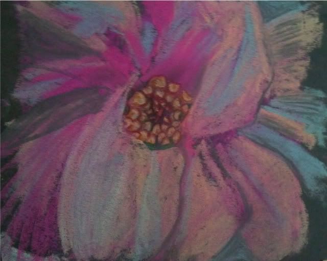
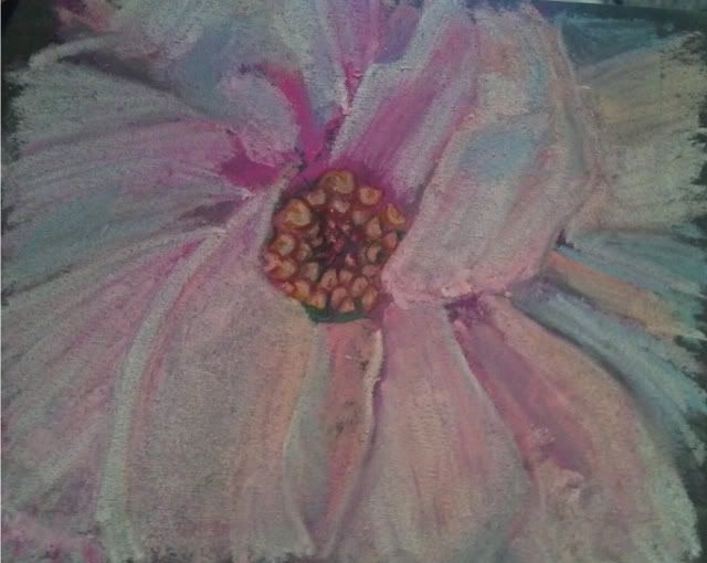 Check out the progression... I hope you enjoy it!