
A glimpse into all things crafted by these hands. Could be photography, paintings, crafts, gardening, jewelry...whatever is appealing in the moment!
Thursday, May 7, 2020
Tuesday, April 4, 2017
A Groomer Too?

 Don't we all like a little Latte? Well that's this little puppers name. She came to me quite the curly cue. We got her all tidied up and now a cutie pie she is.
 When I had originally set up this blog, my weekly dog grooms were going to be something I also shared on here. As you can tell from my lack of posting, it's not that I haven't created new content, I just haven't shared any of it with you!
I'm hoping to go into some of my saved stuff and get a bit caught up. Then maybe you'll still want to share my journey as it moves forward!
Sunday, April 10, 2016
Cardboard Shields for the boys and girl

We tried to follow a color pattern. My husband handles all the cutting and shaping cardboard while I handled all the painting.

The kids loved them!!
 We had the itch to make some shields after buying 5 Nerf swords to give the culdesac kiddos to play with. We got out white poster board, free handed the shield shape and the cut cardboard boxes in the same shape to match. The backs and handles were also oodles of cardboard and duct tape as was the edges of each shield.
We took the designs from my son's favorite app on my phone, the Lego Knights. 5 kids and 5 designs... Perfect!!

Saturday, April 9, 2016
My first Plein Air: Lake Oneida at UNF with FCPAP

I did it. I got all the equipment. I got the box, I got the easel, I got new pastels, I got a beautiful day, a great instructor, and just had a glorious time. My very first time painting Plein air. Let's just say I will be doing it again! I'm hooked!
Pastel in Premier sanded paper, 8x10
Sunday, March 13, 2016
My friend's Molly in pastel. A Shih-tzu portrait.
Got to play with a sampler pack of Richeson sanded paper.
Was deciding what to get a friend for her 40th and finally broke open the pack.
5x7 using Stabilo CarbOthello pastel pencils and some Rembrandts for the background and body. Shih-tzu Molly

Friday, March 11, 2016
My Ted Head Watercolor Sunset class
18x12 Winsor Newton Professional watercolors on Arches cold press.
I splurged on some watercolors and took an actual class. I will be doing more now that I have good materials... they really do make a difference!

I splurged on some watercolors and took an actual class. I will be doing more now that I have good materials... they really do make a difference!

Thursday, March 10, 2016
Magnolia - A commission in watercolor
I had gone to a Ted Head watercolor workshop recently and I learned quite a bit about handling some brand-new professional type watercolors.
Up until now I have only been practicing, so I've been using the small pans --typically Koi or some Grumbacher pans. I finally went out and got some professional Winsor & Newton tubes, got a pallet, got a sheet of Arches...stretched it (my first time) and --wow what a difference.
I showed my first painting on Facebook and the response reminded me I needed to be doing more art! So I was asked to do a magnolia. I definitely will be doing more!

Saturday, November 21, 2015

Saturday, October 10, 2015

Sunday, October 4, 2015


Friday, May 8, 2015
A bit of journaling
Been a little while since I've posted any content. I realize I need to upload something now and again, even if it's not a finished piece. I think I just find myself holding back any uploads until I have completed something. Then all of a sudden it's been six months and I haven't done anything all the way through. So here's some playing around I did tonight just to get the creative juices flowing. Hopefully there will be something a little bit more finished in the near future. Or just more!  Yarka watercolors on Strathmore Art Journal 8x10
Sunday, December 28, 2014
Sunset over the boat yard.

Wednesday, March 19, 2014

Snow flocked pines
 Not a dot of actual white. The black is very dark green. The white is really grey, light blue, frosty pink, and the brightest white is actually a creamy yellow. Fun challenge to avoid using pure white.
 Pastel on Canson pastel pad 4x6
Sunday, January 27, 2013
New York in the Rain - Pastel in the Chelsea District
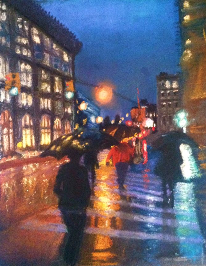 |
| "Chelsea In the Rain" 9" x 12" pastel on sanded board |
On a trip to New York City last October I had the luck of having my camera handy while a drizzly day ensued. The umbrellas I saw as a beautiful punctuation to the streets and braved getting my DSLR wet to get some photos. This is a pastel piece (still learning to use pastel) that took me about 3 different sessions. I am still thinking of some tweaks I'd like to do but don't want it to be otherwise overworked. I have pulled off all the labels on my pastels but there is a mix of brands in there.
This was also my first homemade pastelboard. I bought some leftover mat board that was uber cheap and used a mixture of sanded (liquid paint like stuff that has sand in it to create a textured surface) primer and a brown paint to make my own paper. Since pastel paper is several dollars per sheet this was a way to keep it less pricey.
I can't recall the exact street but I know we had walked a few blocks up and over from the Flatiron Origins building and were in the Chelsea District, hence the title.
The blur on the right side is still challenging me. In the original photo it is a partial building side and roof jutting, hence the odd angle.
Thank you for looking and I would love your comments. Too cartoony? Good contrast? I did enjoy the wet ground and all the colors.
Saturday, September 22, 2012
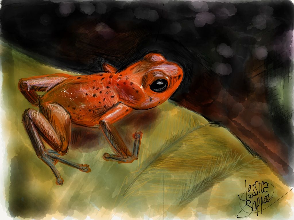
Digital Painting of a Tree Frog
 .
.
Ok, so I swore I would never create, much less appreciate a digital drawing. I've come to have a new found respect for them however after finding a huge lack of time and creativity. This was created quite quickly with an awesome program called Paper by 53.
Using my iPad and a stylus and then just good old fashion drawing methods, I am able to squeeze in a little drawing time when I normally wouldn't care to lug out the art supplies...especially in front of the 2 year old!
Did you see how long it has been since my last creation? Exactly!
Sunday, May 27, 2012
A little change - Watercolor Daisy and Ladybug
 |
| Watercolor on Canson 9x12 |
As much as I have fallen in love with the soft glow of pastels, I am not prepared to create a travel box of them and the watercolors come in such a portable, ready to go set! I need to watch some other plein-air soft pastelists and maybe I can put together a small box. I do so need to learn about the greens!
Saturday, May 26, 2012
Working again on being more painterly, Continued!
Being more painterly, a lot harder than it looks!
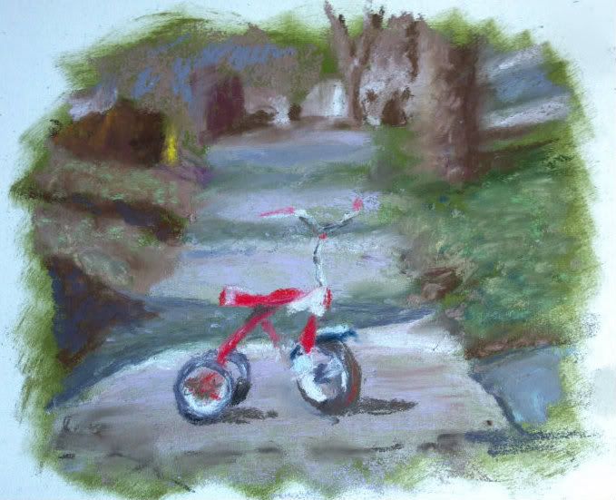
As you may have already read, I struggle with creating art that I actually love. I am a left-brained artist; that is, I paint what I see. But I admire those works with those strokes that are soft-edged, flowing, have movement in them and evoke that emotional appeal.
I have continued to try to work out of my comfort zone and found a reference photo at Wet Canvas that was part of a soft pastel workshop last month.
This tricycle made me feel young again, and love the timely feel of it. My son also has a very similar red, Radio Flyer tricycle so it reminded me of him.
I started with the contrast underpainting again, a style I have grabbed hold of fully, and attempted to only "suggest" the lines of the tricycle, the trees, to soften the focus in the background and basically take these last few months of learning this medium and practice all those techniques in one painting! I find the vignette style edging actually draws you in to a "memory" or dreamlike moment, so I kept it.
I would love to hear your comments, especially those of you who have seen my detailed works. Is it an improvement or does it need something else?
Thursday, April 26, 2012
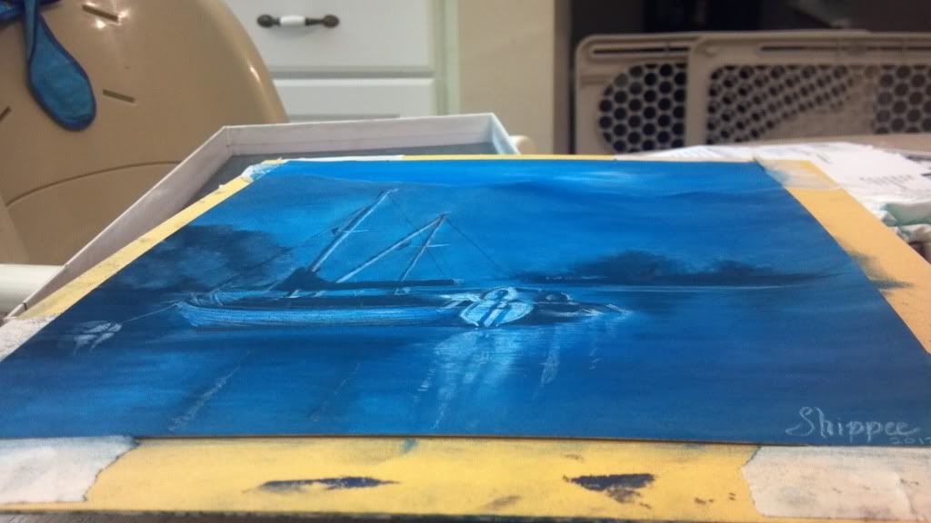
Monochromatic Sailboat Painting: Creating Contrast With One Color
Sometimes I use internet art-based forums to find challenges that motivate me to try something new. This month's challenge on "Paint My Photo" is to interpret a photo posted by another member with a monochromatic painting. It's a really great site where people freely post their original photography and basically let you create whatever it motivates you to create! Some of the stuff people are willing to share is simply stunning, such as the original to this piece here.
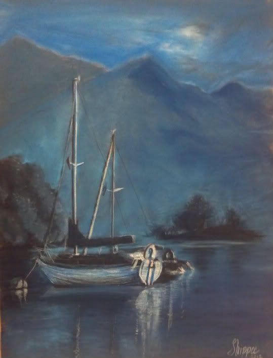 |
| 9"x12" Soft Pastel on Pastelmat "Evening Tranquility" |
The only concern I have is that the cream cast that the paper is creating. I had actually tinted the paper, that is, take one mid-tone blue and swathed it on the entire thing, lightly filling the tooth of the paper so this exact thing wouldn't happen. Perhaps I should have scrubbed it and done another layer. It's very interesting to note that even though I only used 4 shades of blue.. a very dark navy, a normal navy, a midtone blue and a fair sky blue, thanks to the paper and the photograph, it has some interesting grays, creams, and even some violet there in the right corner; I see it!
 |
| A little more true to life. |
Thursday, April 12, 2012
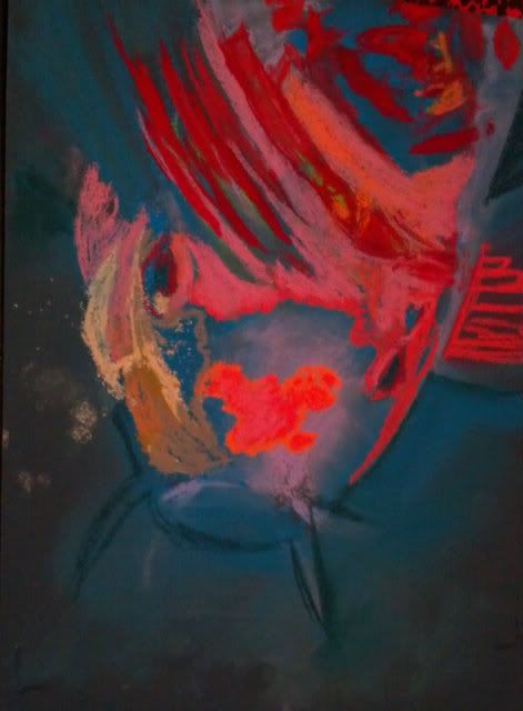
Koi Fish: Trying To Be "Painterly"
Can one learn to be more "painterly"?

 So can this be learned?? I am hoping so. I admire those works that have distinct moods thanks to the bleed of color here, the daub of color that didn't occur in real life there.
Some things I have tried in the Koi Fish painting:
Stop pouring over the details. Those hairs/scales/patterns only need to be suggested, not every one needs to be filled in.
Dot in a color that isn't really there. Drawing a white cat? Put some sky blue and pink through the fur. It really won't look unnatural, just more like art and less like a copy. It really is hard to place bits of color that aren't really there, but I am learning that it really does help to make it overall more interesting.
It's not always a mistake. It's a drawing, so even if it isn't really happening in the photo, you get to choose what feels good, not what is necessarily "right".
These are just some ideas that I've picked up by really digging into those pieces that draw me in through more than just the scenery.
Do you have any ideas that can make a realistic type painter more "painterly"? I'd love to hear from you!
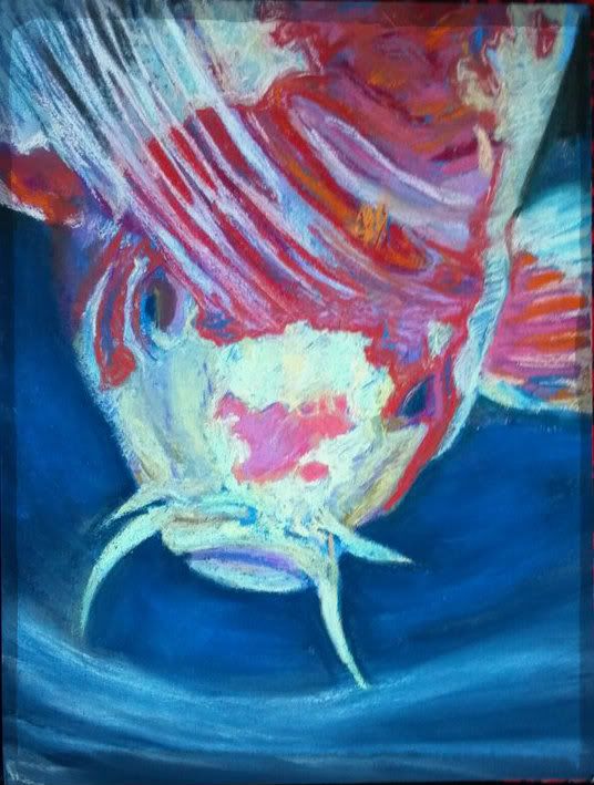 |
| 9"x12" Koi Fish "Surfacing" Soft Pastel on Colourfix |
Subscribe to:
Posts (Atom)