

A glimpse into all things crafted by these hands. Could be photography, paintings, crafts, gardening, jewelry...whatever is appealing in the moment!
Showing posts with label blue. Show all posts
Showing posts with label blue. Show all posts
Sunday, December 28, 2014
Sunset over the boat yard.


Sunday, May 27, 2012
A little change - Watercolor Daisy and Ladybug
 |
| Watercolor on Canson 9x12 |
As much as I have fallen in love with the soft glow of pastels, I am not prepared to create a travel box of them and the watercolors come in such a portable, ready to go set! I need to watch some other plein-air soft pastelists and maybe I can put together a small box. I do so need to learn about the greens!
Thursday, April 12, 2012
Koi Fish: Trying To Be "Painterly"
Can one learn to be more "painterly"?

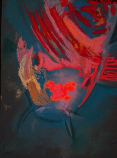 So can this be learned?? I am hoping so. I admire those works that have distinct moods thanks to the bleed of color here, the daub of color that didn't occur in real life there.
Some things I have tried in the Koi Fish painting:
Stop pouring over the details. Those hairs/scales/patterns only need to be suggested, not every one needs to be filled in.
Dot in a color that isn't really there. Drawing a white cat? Put some sky blue and pink through the fur. It really won't look unnatural, just more like art and less like a copy. It really is hard to place bits of color that aren't really there, but I am learning that it really does help to make it overall more interesting.
It's not always a mistake. It's a drawing, so even if it isn't really happening in the photo, you get to choose what feels good, not what is necessarily "right".
These are just some ideas that I've picked up by really digging into those pieces that draw me in through more than just the scenery.
Do you have any ideas that can make a realistic type painter more "painterly"? I'd love to hear from you!
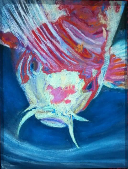 |
| 9"x12" Koi Fish "Surfacing" Soft Pastel on Colourfix |
Sunday, March 11, 2012
Color contrast study - Fox in Pastel
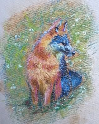 |
| Fox 4"x5" Mungyo pastel on Strathmore Pastel Paper |
I had a fun time playing with color. I was trying to block in the blue but it kind of took over the darker part of the fox. Just having fun. I may tweak this a little, but for now it was just some practice with my new pastels.
Thursday, February 23, 2012
Working Loose - A new thing for me - Street Scene
I was challenged this week by a blog that encouraged you to "Simplify"... that is, don't sweat the small stuff! As someone who thrives on details, I found that I needed to take that step. I worked quick and small, knowing that if I went bigger, it would give me room to put more details; If I kept at it, I would somehow find a way to finagle lots of details in where I thought they should be!
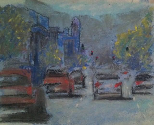 |
| City Scene One Soft Pastel on Strathmore sketch; 5"x 8" |
Working in a fairly new medium to me (the tabby in profile drawing below is my absolute first soft pastel piece ever; this is my second) I decided to let the implied colors thrive. It was fun. I am only somewhat satisfied as I cannot feel it as complete, as simplified as it is from the original. I must learn restraint! I do enjoy the learning experience that comes from this. I will work more on being "loose" and a bit more abstract.
As always, I would love your critiques and comments. This is new composition and a new medium. Heck, I've never even done a landscape before, much less a busy street scene! Be kind.
Tuesday, May 24, 2011
HELP! Choose Between Submissions for ARTunleashed
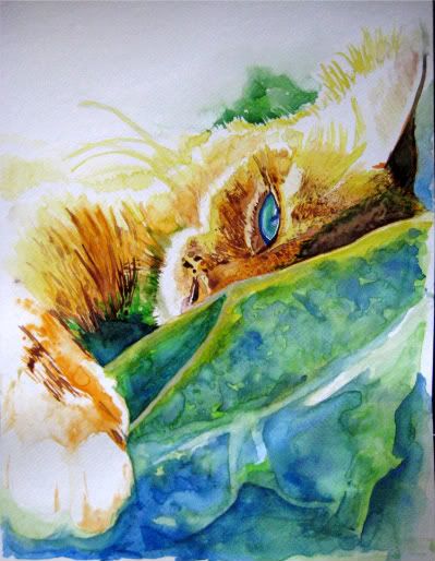
So I have been so motivated by the ARTunleashed project (see previous post) that I have made multiple pieces of art. I am trying to garner your opinion, readers, of which one "speaks" to you the most before I enter it.
I will donate the piece of art to benefit First Coast No More Homeless Pets (FCNMHP). I have to submit the work, fully framed and ready to hang (and give up full rights/ownership). It is then exhibited for free (exposure, awesome!) and there will be a silent auction in which someone may decide to buy your work. It is entered into a juried art show, as well, so there is the possibility of some prizes, including cash!
Whatever bid your art gets up to, will then be donated to FCNMHP, which is a great cause. They provide free or low cost spay/neuter programs to help control excess pet population.
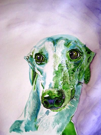
I have to admit, I want to submit just to see if my artwork garners some monetary value or not, but hey, if it doesn't, this will be my first gallery experience, and that alone may get the creative juices flowing. The cause is enough to motivate!
Of the two I have done, which one do you think has the most marketability and the highest chance of helping with exposure? I could enter them both, but the cost of framing and prepping them both for show may be cost prohibitive.
I look forward to your suggestion of which to enter! Both are currently unnamed.. (suggestions? I'm terrible at naming artwork, I always want to do something quite common such as "Cat Nap"... <yawn>.
So... Which one? Cat or Dog? Why?
EDIT: I finally submitted the cat picture. I am excited to say that it was part of a bidding war between two patrons. They bid it up to 160.00 before bidding closed. I certainly was excited and a fun night as well as a great cause. This been a great learning experience to help me to decide what a piece is actually "worth" in the future.
Sunday, March 20, 2011
ARTunleashed 2011
Some of the art I am going to be working on will be to benefit First Coast No More Homeless Pets (FCNMHP). How, you ask? By submitting my artwork, framed and ready to hang.
Submit any animal inspired or animal topic piece in any media type for submission to a juried art show and then your piece is auctioned off in a silent auction with the proceeds benefitting the organization.
If you want to join or find out more, check it out http://www.jaxartunleashed.com/

Submit any animal inspired or animal topic piece in any media type for submission to a juried art show and then your piece is auctioned off in a silent auction with the proceeds benefitting the organization.
If you want to join or find out more, check it out http://www.jaxartunleashed.com/

Last year's winning entry (Not my art)
Coming up next.... work in progress. I'll document a piece every 30 minutes as I work on it. You'll be able to see how my brain creates artwork, step by step. Being a left-brained artist is a little different than you may imagine. Think... topography.
Subscribe to:
Posts (Atom)