Showing posts with label painting. Show all posts

Sunday, April 10, 2016

Cardboard Shields for the boys and girl

We tried to follow a color pattern. My husband handles all the cutting and shaping cardboard while I handled all the painting. 
The kids loved them!!
We had the itch to make some shields after buying 5 Nerf swords to give the culdesac kiddos to play with. We got out white poster board, free handed the shield shape and the cut cardboard boxes in the same shape to match. The backs and handles were also oodles of cardboard and duct tape as was the edges of each shield. 

We took the designs from my son's favorite app on my phone, the Lego Knights. 5 kids and 5 designs... Perfect!!

Sunday, January 27, 2013

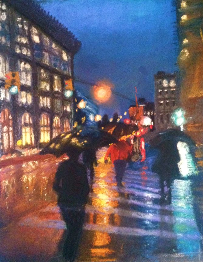
New York in the Rain - Pastel in the Chelsea District

"Chelsea In the Rain"
9" x 12" pastel on sanded board
This is the first creation I have done in a while. It has been so busy that I have only occasionally been able to draw (usually a digital piece on my iPad, usually in the few hours before I nod off, which is much easier than pulling out drawing materials).

On a trip to New York City last October I had the luck of having my camera handy while a drizzly day ensued. The umbrellas I saw as a beautiful punctuation to the streets and braved getting my DSLR wet to get some photos. This is a pastel piece (still learning to use pastel) that took me about 3 different sessions. I am still thinking of some tweaks I'd like to do but don't want it to be otherwise overworked. I have pulled off all the labels on my pastels but there is a mix of brands in there. 

This was also my first homemade pastelboard. I bought some leftover mat board that was uber cheap and used a mixture of sanded (liquid paint like stuff that has sand in it to create a textured surface) primer and a brown paint to make my own paper. Since pastel paper is several dollars per sheet this was a way to keep it less pricey.

I can't recall the exact street but I know we had walked a few blocks up and over from the Flatiron Origins building and were in the Chelsea District, hence the title. 

The blur on the right side is still challenging me. In the original photo it is a partial building side and roof jutting, hence the odd angle. 

Thank you for looking and I would love your comments. Too cartoony? Good contrast? I did enjoy the wet ground and all the colors.

Thursday, April 12, 2012

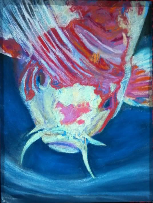
Koi Fish: Trying To Be "Painterly"


Can one learn to be more "painterly"?

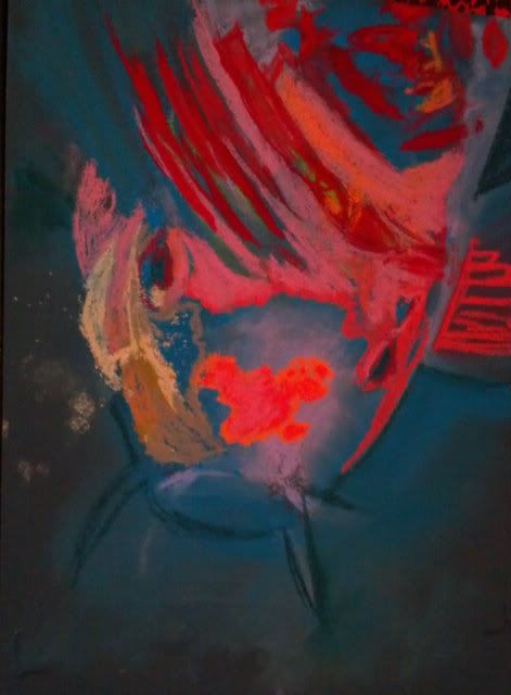
I am working on being more "painterly" that is, to work a little less detail into a painting and make it more interesting with less deliberate strokes. I find it a struggle as a left-brained artist; I tend towards painting what I see, in the color I think I see. I have been continuing to use the contrasting colors to start my paintings (see earlier blog post about using the opposite color to start a painting) and have been trying to be less deliberate about my paint strokes. 
So can this be learned?? I am hoping so. I admire those works that have distinct moods thanks to the bleed of color here, the daub of color that didn't occur in real life there. 
Some things I have tried in the Koi Fish painting: 
Stop pouring over the details. Those hairs/scales/patterns only need to be suggested, not every one needs to be filled in.
Dot in a color that isn't really there. Drawing a white cat? Put some sky blue and pink through the fur. It really won't look unnatural, just more like art and less like a copy. It really is hard to place bits of color that aren't really there, but I am learning that it really does help to make it overall more interesting. 
It's not always a mistake. It's a drawing, so even if it isn't really happening in the photo, you get to choose what feels good, not what is necessarily "right". 
These are just some ideas that I've picked up by really digging into those pieces that draw me in through more than just the scenery. 
Do you have any ideas that can make a realistic type painter more "painterly"? I'd love to hear from you! 
9"x12" Koi Fish "Surfacing"
Soft Pastel on Colourfix

Sunday, February 26, 2012

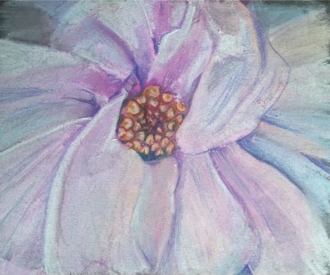
One Magnolia - Georgia O'Keefe Style


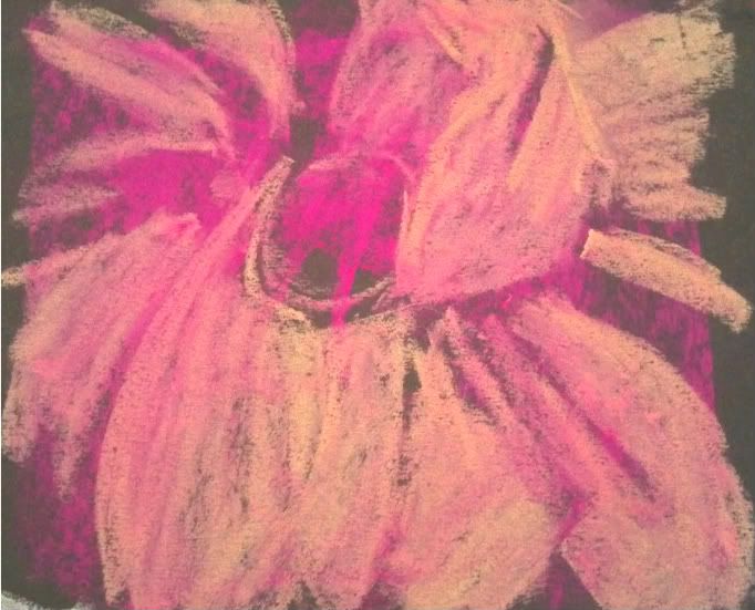
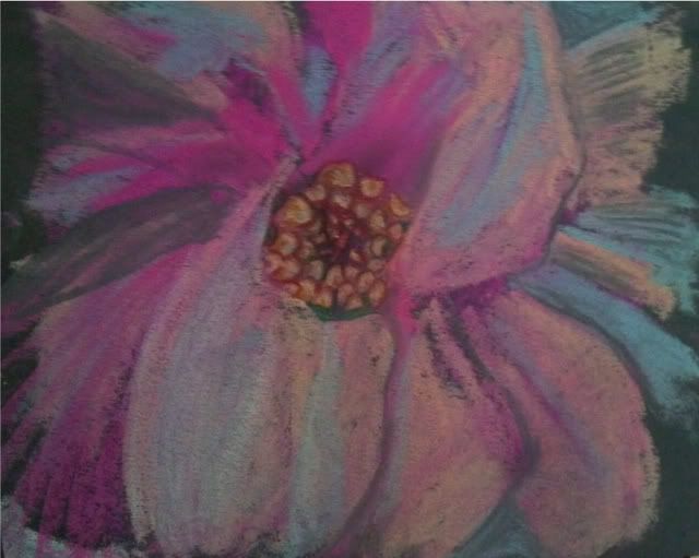
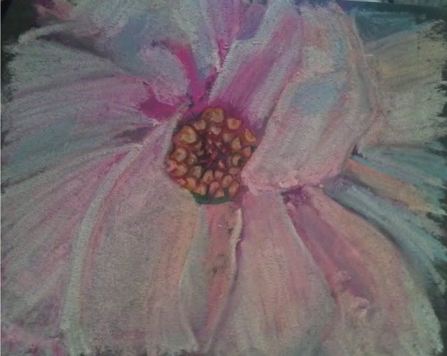
One Magnolia
6"x7" Soft Pastel on Mi-Tientes


I made this to contribute to a challenge to try to paint up close and frame-filling in the style of Georgia O'Keefe. I had never painted a magnolia before and this is only my 3rd attempt at soft pastels. I must admit I am liking them and feel I may need to upgrade. I have "Hobby Lobby" variety at this time which is at best a student grade. With pastel sticks starting around 2.00 or so...it may just be a while.
I didn't have any sort of light palette. I had fuschia, turquoise, and a creamy orange that I used to lay in the values. I then took about 1/4 of my white stick to try to make the colors I was missing. Maybe I'll buy some singular sticks in a white palette to start my collection, as you should really never use true white in your artwork if you can avoid it. 
Check out the progression... I hope you enjoy it!
I

Sunday, February 19, 2012

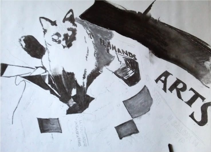
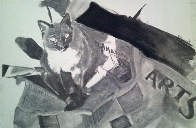
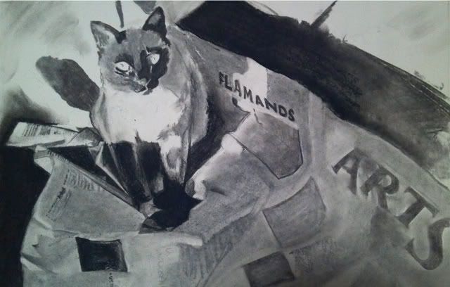
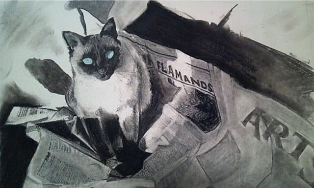
Siamese Cat on Newspaper - Black and White Pastel / Charcoal

Step 1. Charcoal Block In of Siamese Cat on Newspaper


Step 2. Lay in mid tones and grays in Siamese and newspaper
Working on a new project. I want to try out the pastels some more. Still not sure how I'm going to work this one out. 
Step 3. Start to lift some color out of paper with eraser and
detail the newspaper


The subject is a Siamese Cat, with vividly lit eyes doing what cat's do... crawling into the middle of the newspaper and getting comfortable. I got the idea to start this piece after I put a piece of paper I was measuring for my next piece on the ground (my first mistake), and my cat decided to walk right into the middle, essentially destroying it for professional work (wrinkles and crinkles). 


This is not my cat but the situation reminded me of a photo circa 1947 that I had in one of my cat books. I had been wanting to endeavor it but I am not the most patient what with all the newspaper print. It *will* be interesting, especially since it is French! Work in progress. Will continue to keep updated as I progress.

I toyed with the idea of coloring in the cat. Seal Point Siamese Cats have such beautiful cream coats and creamy brown "points" or darkenings. I started with the blue eyes as my first bit of color, and, well, I kind of stopped there.

A pop of color. Cat eyes are so fun. Starting to detail
the paper and Siamese cat


What do you think? 

Saturday, February 11, 2012

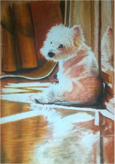
Reflections


I started working on the concept of a reflection of this Westie but am struggling with the lack of "physics"in this piece. What I mean, is....you would think, even though this is a highly polished floor he is sitting on (and I am referencing from a photo) that there would be a darkening of the floor and dog, but in actuality it is quite bright and even brighter in some spots rather than darker, even though the floor is of a terra-cotta coloring. 

I think the sun is emblazoning it to make it brighter, rather than making the subject diminutive. I may have to crop out about half of the reflection to not make it such a focal point, though I am enjoying the attempt at creating it. Others have told me I should take out the reflection or darken it...but the photograph tells me otherwise. Should I go with artistic license or take a chance at actual recreation? (my strong point... I don't consider myself a creative artist as much as a good reference artist). I'd love your feedback. I may change the crop and concept. We will see! Thanks for viewing. 

Tuesday, May 24, 2011

HELP! Choose Between Submissions for ARTunleashed


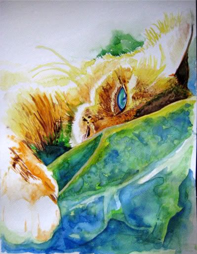
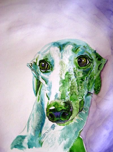
So I have been so motivated by the ARTunleashed project (see previous post) that I have made multiple pieces of art. I am trying to garner your opinion, readers, of which one "speaks" to you the most before I enter it.

I will donate the piece of art to benefit First Coast No More Homeless Pets (FCNMHP). I have to submit the work, fully framed and ready to hang (and give up full rights/ownership). It is then exhibited for free (exposure, awesome!) and there will be a silent auction in which someone may decide to buy your work. It is entered into a juried art show, as well, so there is the possibility of some prizes, including cash!

Whatever bid your art gets up to, will then be donated to FCNMHP, which is a great cause. They provide free or low cost spay/neuter programs to help control excess pet population.


I have to admit, I want to submit just to see if my artwork garners some monetary value or not, but hey, if it doesn't, this will be my first gallery experience, and that alone may get the creative juices flowing. The cause is enough to motivate!

Of the two I have done, which one do you think has the most marketability and the highest chance of helping with exposure? I could enter them both, but the cost of framing and prepping them both for show may be cost prohibitive.

I look forward to your suggestion of which to enter! Both are currently unnamed.. (suggestions? I'm terrible at naming artwork, I always want to do something quite common such as "Cat Nap"... <yawn>.

So... Which one? Cat or Dog? Why?

EDIT: I finally submitted the cat picture. I am excited to say that it was part of a bidding war between two patrons. They bid it up to 160.00 before bidding closed. I certainly was excited and a fun night as well as a great cause. This been a great learning experience to help me to decide what a piece is actually "worth" in the future.

Sunday, March 20, 2011

ARTunleashed 2011

Some of the art I am going to be working on will be to benefit First Coast No More Homeless Pets (FCNMHP). How, you ask? By submitting my artwork, framed and ready to hang.

Submit any animal inspired or animal topic piece in any media type for submission to a juried art show and then your piece is auctioned off in a silent auction with the proceeds benefitting the organization.

If you want to join or find out more, check it out http://www.jaxartunleashed.com/

Last year's winning entry (Not my art)

Coming up next.... work in progress. I'll document a piece every 30 minutes as I work on it. You'll be able to see how my brain creates artwork, step by step. Being a left-brained artist is a little different than you may imagine. Think... topography.

Saturday, March 19, 2011

How I Started Using Watercolors

This is where it all started: 


My love for watercolors... I was about 7 months pregnant and only working about 3 days a week. My girlfriend and fellow artist Kati stayed home with her daughter weekdays and helped her husband by working from home (he is a talented graphic designer). I have been afraid of color for the majority of my life. Art teachers forced it on me, a requisite to complete the class.

If it were up to me, I'd be wielding charcoal and mechanical pencil for the rest of my life, and maybe the occasional ballpoint pen. Those made wonderful drawings on lined paper. The best part was the texture of the inside of my notebook cover. The thick, easily dented surface made my ballpoint rich and every line flowed beautifully. Those drawings were a thing of beauty...shame I never saved any of them. The doodles while pondering the history of the world (ok, not really, I hated history, hence the doodling... I was probably pondering what time I could get out of there).

Okay, back on track... I was at my friend, Kati's house and she had a watercolor set. I had bought some watercolor paper and a few basic materials on the way to her house and we had decided we'd just jump into it. Materials I had purchased were entry level, so I didn't feel too scared of wasteful spending.

Kati ends up playing with a monotone piece (hopefully she'll let me share it on here, I did envy it so) and I had this photograph of an old rusty truck I found on a photography site (another passion of mine). I had previously e-mailed the owner that I thought it was gorgeous and would he mind if I did a painting of it? He was absolutely endeared to have the compliment and granted me full go-ahead. I promised to send him a copy when it was done.

So I start using my cheap, convenience store class watercolors and am able to lay in a foundation of color and create this truck painting. Not bad, I'm thinking... but wanting some richness I start laying it on thicker. I notice Kati has this other set and I ask if I can try them. What a difference! These were oily, not chalky like my store-bought counterpart. The depth of color is nothing like I knew one could accomplish with watercolor. What a difference high-quality stuff makes. I might have been turned off to the concept if I hadn't tried these. I finished the truck piece and, even being my first attempt, is still my favorite watercolor.

So the love affair with watercolor has begun. Thought I might call it a love-hate relationship (light areas are not forgiving if you get dark on them; pausing in the middle of working because it is too wet to continue and I need to add another layer but I have to wait (gasp) for it to dry. (I've remedied this by working on two simultaneously) I tend to work in fastidious stretches, with breaks lasting for days, and art supplies left all awry in the process (as much as possible with a 9 month old couch-surfing)

This is my first endeavor into watercolor. My lack of control with the media has become a bit of a feature I love about it. The dripping of the color on my page worked well with the dripping of rust, and the exaggerated color schemes I have started with this piece continue to be the theme of most of my other work (green dog, anyone?).