Showing posts with label painterly. Show all posts

Saturday, May 26, 2012

Working again on being more painterly, Continued!

Being more painterly, a lot harder than it looks! 
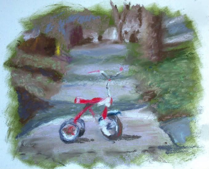
As you may have already read,  I struggle with creating art that I actually love. I am a left-brained artist; that is, I paint what I see. But I admire those works with those strokes that are soft-edged, flowing, have movement in them and evoke that emotional appeal. 

I have continued to try to work out of my comfort zone and found a reference photo at Wet Canvas that was part of a soft pastel workshop last month. 

This tricycle made me feel young again, and love the timely feel of it. My son also has a very similar red, Radio Flyer tricycle so it reminded me of him. 

I started with the contrast underpainting again, a style I have grabbed hold of fully, and attempted to only "suggest" the lines of the tricycle, the trees, to soften the focus in the background and basically take these last few months of learning this medium and practice all those techniques in one painting! I find the vignette style edging actually draws you in to a "memory" or dreamlike moment, so I kept it. 

I would love to hear your comments, especially those of you who have seen my detailed works. Is it an improvement or does it need something else? 

Thursday, April 12, 2012

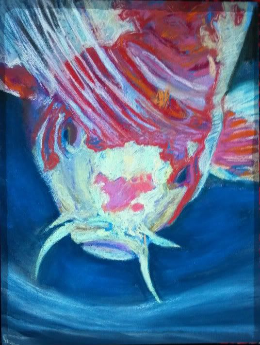
Koi Fish: Trying To Be "Painterly"


Can one learn to be more "painterly"?

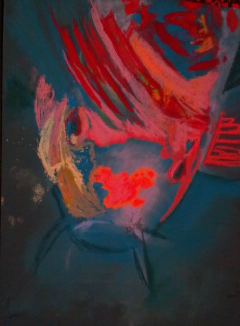
I am working on being more "painterly" that is, to work a little less detail into a painting and make it more interesting with less deliberate strokes. I find it a struggle as a left-brained artist; I tend towards painting what I see, in the color I think I see. I have been continuing to use the contrasting colors to start my paintings (see earlier blog post about using the opposite color to start a painting) and have been trying to be less deliberate about my paint strokes. 
So can this be learned?? I am hoping so. I admire those works that have distinct moods thanks to the bleed of color here, the daub of color that didn't occur in real life there. 
Some things I have tried in the Koi Fish painting: 
Stop pouring over the details. Those hairs/scales/patterns only need to be suggested, not every one needs to be filled in.
Dot in a color that isn't really there. Drawing a white cat? Put some sky blue and pink through the fur. It really won't look unnatural, just more like art and less like a copy. It really is hard to place bits of color that aren't really there, but I am learning that it really does help to make it overall more interesting. 
It's not always a mistake. It's a drawing, so even if it isn't really happening in the photo, you get to choose what feels good, not what is necessarily "right". 
These are just some ideas that I've picked up by really digging into those pieces that draw me in through more than just the scenery. 
Do you have any ideas that can make a realistic type painter more "painterly"? I'd love to hear from you! 
9"x12" Koi Fish "Surfacing"
Soft Pastel on Colourfix