Showing posts with label white. Show all posts

Thursday, March 10, 2016

Magnolia - A commission in watercolor

I had gone to a Ted Head watercolor workshop recently and I learned quite a bit about handling some brand-new professional type watercolors. 

Up until now I have only been practicing, so I've been using the small pans --typically Koi or some Grumbacher pans. I finally went out and got some professional Winsor & Newton tubes, got a pallet, got a sheet of Arches...stretched it (my first time) and --wow what a difference. 

 I showed my first painting on Facebook and the response reminded me I needed to be doing more art! So I was asked to do a magnolia. I definitely will be doing more! 

Wednesday, March 19, 2014

Snow flocked pines


Not a dot of actual white. The black is very dark green. The white is really grey, light blue, frosty pink, and the brightest white is actually a creamy yellow. Fun challenge to avoid using pure white. 

Pastel on Canson pastel pad 4x6

Thursday, April 12, 2012

Koi Fish: Trying To Be "Painterly"


Can one learn to be more "painterly"?

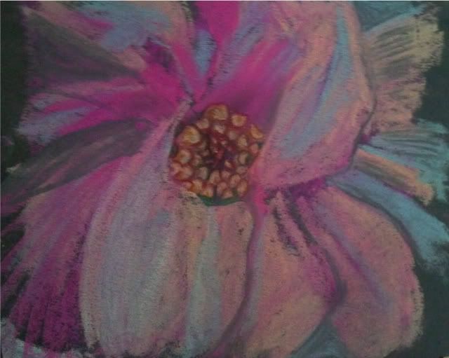
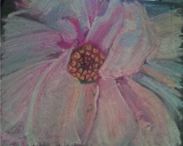
I am working on being more "painterly" that is, to work a little less detail into a painting and make it more interesting with less deliberate strokes. I find it a struggle as a left-brained artist; I tend towards painting what I see, in the color I think I see. I have been continuing to use the contrasting colors to start my paintings (see earlier blog post about using the opposite color to start a painting) and have been trying to be less deliberate about my paint strokes. 
So can this be learned?? I am hoping so. I admire those works that have distinct moods thanks to the bleed of color here, the daub of color that didn't occur in real life there. 
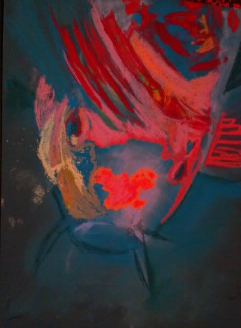
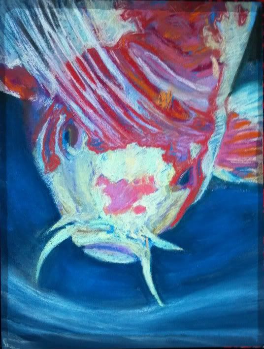
Some things I have tried in the Koi Fish painting: 
Stop pouring over the details. Those hairs/scales/patterns only need to be suggested, not every one needs to be filled in.
Dot in a color that isn't really there. Drawing a white cat? Put some sky blue and pink through the fur. It really won't look unnatural, just more like art and less like a copy. It really is hard to place bits of color that aren't really there, but I am learning that it really does help to make it overall more interesting. 
It's not always a mistake. It's a drawing, so even if it isn't really happening in the photo, you get to choose what feels good, not what is necessarily "right". 
These are just some ideas that I've picked up by really digging into those pieces that draw me in through more than just the scenery. 
Do you have any ideas that can make a realistic type painter more "painterly"? I'd love to hear from you! 
9"x12" Koi Fish "Surfacing"
Soft Pastel on Colourfix

Sunday, February 26, 2012

One Magnolia - Georgia O'Keefe Style


One Magnolia
6"x7" Soft Pastel on Mi-Tientes


I made this to contribute to a challenge to try to paint up close and frame-filling in the style of Georgia O'Keefe. I had never painted a magnolia before and this is only my 3rd attempt at soft pastels. I must admit I am liking them and feel I may need to upgrade. I have "Hobby Lobby" variety at this time which is at best a student grade. With pastel sticks starting around 2.00 or so...it may just be a while.
I didn't have any sort of light palette. I had fuschia, turquoise, and a creamy orange that I used to lay in the values. I then took about 1/4 of my white stick to try to make the colors I was missing. Maybe I'll buy some singular sticks in a white palette to start my collection, as you should really never use true white in your artwork if you can avoid it. 
Check out the progression... I hope you enjoy it!
I