 John. Pastel 4x6
A glimpse into all things crafted by these hands. Could be photography, paintings, crafts, gardening, jewelry...whatever is appealing in the moment!
Showing posts with label pastel. Show all posts
Showing posts with label pastel. Show all posts
Wednesday, March 19, 2014


Snow flocked pines
 Not a dot of actual white. The black is very dark green. The white is really grey, light blue, frosty pink, and the brightest white is actually a creamy yellow. Fun challenge to avoid using pure white.
 Pastel on Canson pastel pad 4x6
Sunday, January 27, 2013
New York in the Rain - Pastel in the Chelsea District
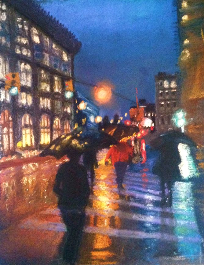 |
| "Chelsea In the Rain" 9" x 12" pastel on sanded board |
On a trip to New York City last October I had the luck of having my camera handy while a drizzly day ensued. The umbrellas I saw as a beautiful punctuation to the streets and braved getting my DSLR wet to get some photos. This is a pastel piece (still learning to use pastel) that took me about 3 different sessions. I am still thinking of some tweaks I'd like to do but don't want it to be otherwise overworked. I have pulled off all the labels on my pastels but there is a mix of brands in there.
This was also my first homemade pastelboard. I bought some leftover mat board that was uber cheap and used a mixture of sanded (liquid paint like stuff that has sand in it to create a textured surface) primer and a brown paint to make my own paper. Since pastel paper is several dollars per sheet this was a way to keep it less pricey.
I can't recall the exact street but I know we had walked a few blocks up and over from the Flatiron Origins building and were in the Chelsea District, hence the title.
The blur on the right side is still challenging me. In the original photo it is a partial building side and roof jutting, hence the odd angle.
Thank you for looking and I would love your comments. Too cartoony? Good contrast? I did enjoy the wet ground and all the colors.
Thursday, April 26, 2012
Monochromatic Sailboat Painting: Creating Contrast With One Color
Sometimes I use internet art-based forums to find challenges that motivate me to try something new. This month's challenge on "Paint My Photo" is to interpret a photo posted by another member with a monochromatic painting. It's a really great site where people freely post their original photography and basically let you create whatever it motivates you to create! Some of the stuff people are willing to share is simply stunning, such as the original to this piece here.
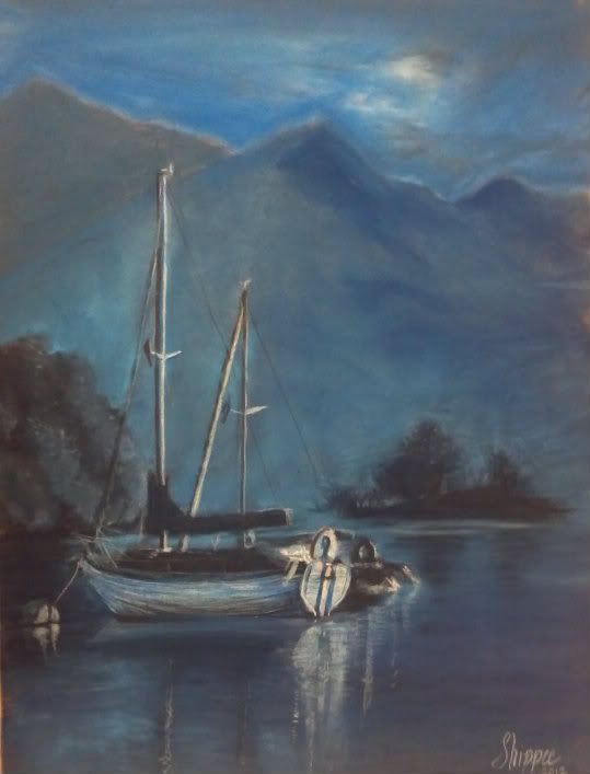 |
| 9"x12" Soft Pastel on Pastelmat "Evening Tranquility" |
The only concern I have is that the cream cast that the paper is creating. I had actually tinted the paper, that is, take one mid-tone blue and swathed it on the entire thing, lightly filling the tooth of the paper so this exact thing wouldn't happen. Perhaps I should have scrubbed it and done another layer. It's very interesting to note that even though I only used 4 shades of blue.. a very dark navy, a normal navy, a midtone blue and a fair sky blue, thanks to the paper and the photograph, it has some interesting grays, creams, and even some violet there in the right corner; I see it!
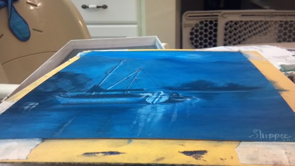 |
| A little more true to life. |
Thursday, April 12, 2012
Koi Fish: Trying To Be "Painterly"
Can one learn to be more "painterly"?

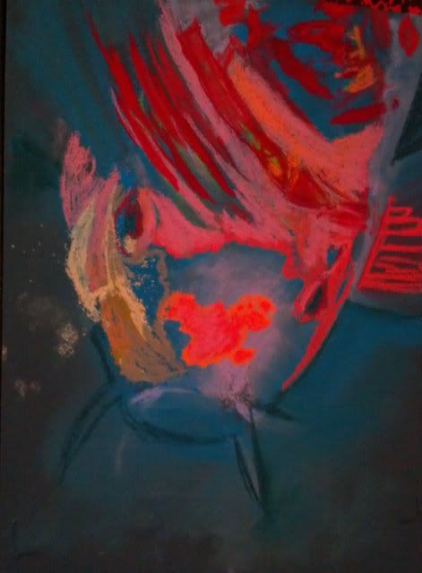 So can this be learned?? I am hoping so. I admire those works that have distinct moods thanks to the bleed of color here, the daub of color that didn't occur in real life there.
Some things I have tried in the Koi Fish painting:
Stop pouring over the details. Those hairs/scales/patterns only need to be suggested, not every one needs to be filled in.
Dot in a color that isn't really there. Drawing a white cat? Put some sky blue and pink through the fur. It really won't look unnatural, just more like art and less like a copy. It really is hard to place bits of color that aren't really there, but I am learning that it really does help to make it overall more interesting.
It's not always a mistake. It's a drawing, so even if it isn't really happening in the photo, you get to choose what feels good, not what is necessarily "right".
These are just some ideas that I've picked up by really digging into those pieces that draw me in through more than just the scenery.
Do you have any ideas that can make a realistic type painter more "painterly"? I'd love to hear from you!
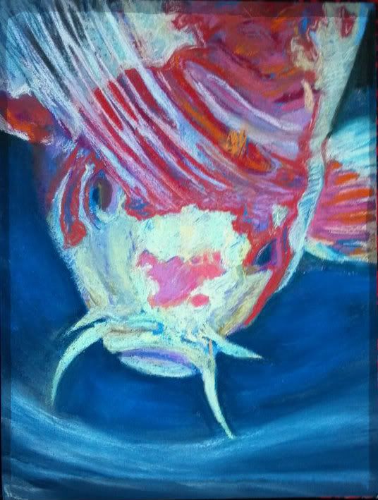 |
| 9"x12" Koi Fish "Surfacing" Soft Pastel on Colourfix |
Sunday, March 11, 2012
Color contrast study - Fox in Pastel
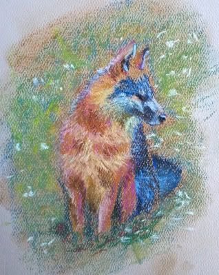 |
| Fox 4"x5" Mungyo pastel on Strathmore Pastel Paper |
I had a fun time playing with color. I was trying to block in the blue but it kind of took over the darker part of the fox. Just having fun. I may tweak this a little, but for now it was just some practice with my new pastels.
Sunday, February 26, 2012
One Magnolia - Georgia O'Keefe Style
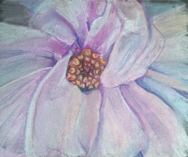 |
One Magnolia
6"x7" Soft Pastel on Mi-Tientes
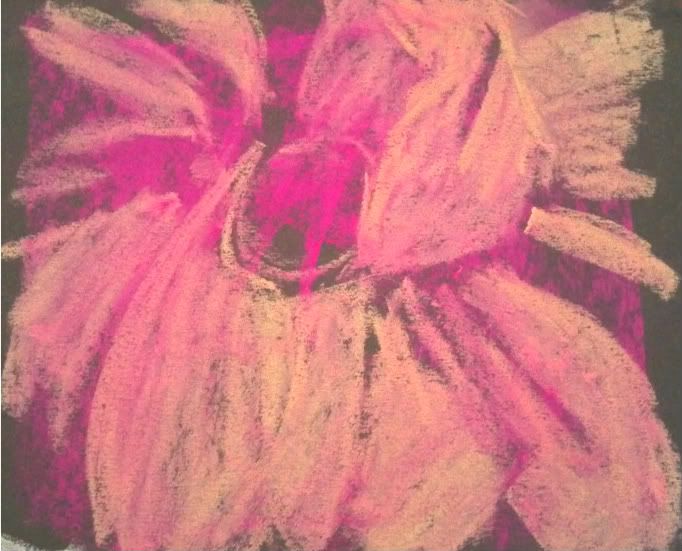 I made this to contribute to a challenge to try to paint up close and frame-filling in the style of Georgia O'Keefe. I had never painted a magnolia before and this is only my 3rd attempt at soft pastels. I must admit I am liking them and feel I may need to upgrade. I have "Hobby Lobby" variety at this time which is at best a student grade. With pastel sticks starting around 2.00 or so...it may just be a while.
 I didn't have any sort of light palette. I had fuschia, turquoise, and a creamy orange that I used to lay in the values. I then took about 1/4 of my white stick to try to make the colors I was missing. Maybe I'll buy some singular sticks in a white palette to start my collection, as you should really never use true white in your artwork if you can avoid it.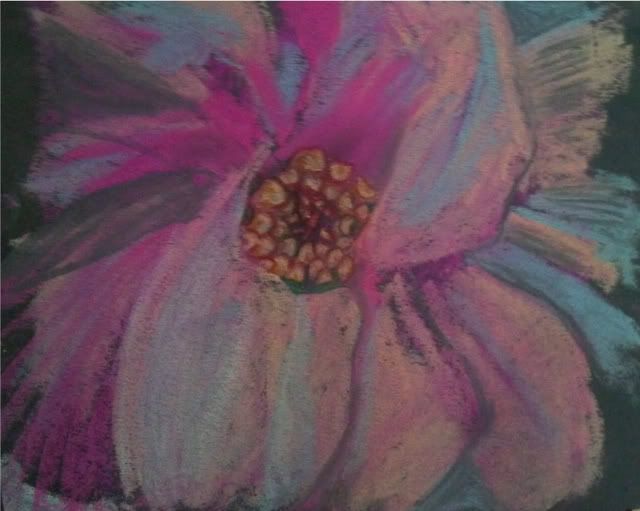
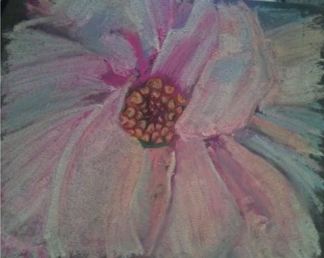 Check out the progression... I hope you enjoy it!
I
Saturday, February 11, 2012
Reflections
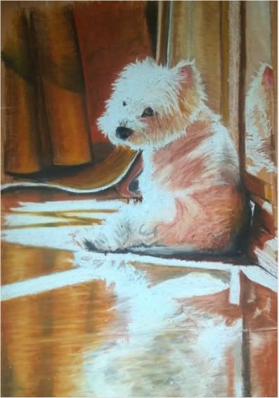
I started working on the concept of a reflection of this Westie but am struggling with the lack of "physics"in this piece. What I mean, is....you would think, even though this is a highly polished floor he is sitting on (and I am referencing from a photo) that there would be a darkening of the floor and dog, but in actuality it is quite bright and even brighter in some spots rather than darker, even though the floor is of a terra-cotta coloring.
I think the sun is emblazoning it to make it brighter, rather than making the subject diminutive. I may have to crop out about half of the reflection to not make it such a focal point, though I am enjoying the attempt at creating it. Others have told me I should take out the reflection or darken it...but the photograph tells me otherwise. Should I go with artistic license or take a chance at actual recreation? (my strong point... I don't consider myself a creative artist as much as a good reference artist). I'd love your feedback. I may change the crop and concept. We will see! Thanks for viewing.
Subscribe to:
Posts (Atom)